Tuesday, November 30, 2021

Concept Summary | Currey Creek Bulls


Logo Design Austin-Currey Creek-Austin Logo

 Logo created for a Bull Riding Team


Now I must admit this logo was fun to create. A bull riding team in San Antonio, TX was looking for a talented Austin logo designer to create their new logo that would be very prominent in rodeos, on hats, t-shirts and other merchandise. When you get a company that has the same 2 letters in the name, sometimes those are just the projects that just work perfectly. In this case I mirrored the 2 C's in the "Currey Creek" name which created the perfect negative space to create the bull as the focal point. 

The yellow and black color scheme really jump out and give the logo the high energy it needs being how this is for such a high energy sport as bull riding.  It was important when creating this logo that it would look great on apparel and other merchandise so by framing the logo in a black oval implied a "belt buckle" which is very symbolic in western culture.

Concept Summary | Kilman Associates


Logo Design Austin-K Associates Austin Logo

 Logo created for a Consulting Firm


Kilman Associates was looking for a qualified Logo Design company to help them create their new brand. The company is traditional so they wanted something unique to make them stand apart from their competition from other consulting firms in the area. I chose the strategy of playing off the company's initials, using the K and the A as artwork in a clean, modern design.

The monochromatic brown color scheme works well to give it that classic, traditional look while the logo is modern and fresh in contrast. Finding the right graphic designer is really important to creating a successful logo that will last the lifetime of the company and always feel new and fresh.


Thursday, November 25, 2021

Concept Summary | ARQ Genetics


Logo Design Austin-ARQ Genetics Austin Logo Austin

 Logo created for DNA/Genetic Testing Lab


As an experienced Austin Tx logo design company, I get asked this question quite a lot from a client..."what makes a great logo?" Simple answer is simplicity and a clean design. A genetics lab contacted me in need of a new brand. They were a startup and needed a new logo, website and business cards.

It's subtle, but if you look closely you will see the clever concept of the DNA strand (above the letter R) actually create the shape of an "A" in the ARQ name thus making this a more memorable brand. A sleek color scheme of slate gray with dark blue accents followed by a pop of yellow really bring this logo to life.

 Creating a successful logo for an Austin startup begins with a talented and experienced graphic designer. A logo really helps give your company credibility in this competitive business world. 

View My Design Portfolio


Tuesday, November 23, 2021

Concept Summary | Land Apparel


Logo Design Austin-LAND Austin Logo Austin

 Logo created for Lifestyle/Progressive Apparel Line


I had the privilege to design this logo for a lifestyle apparel brand. The company called "LAND" was looking for a talented logo designer to come up with a logo for this startup. The idea behind this brand was very organic so I created the logo to look as if it was indeed a part of land, giving it a shape reminiscent of looking at a land structure from a globe. The colors blend seamlessly together bringing in all the warm, earth tone hues to further evoke that organic feel.


This creative logo really came together beautifully and the client was extremely happy with the final product. The logo would be integrated on the apparel line (clothes, hats, hoodies, jackets, etc..) as well as for all digital marketing. Want to see more? I invite you to view my graphic design portfolio here.

Monday, November 22, 2021

Concept Summary | Fighters First


Logo Design Austin-Fighters First Austin Logo Austin


Logo created for a Martial Arts Studio


A Martial Arts studio in Austin reached out to me to rebrand their existing logo into something more modern and fresh. The client told me that they wanted something that would translate easily to apparel, hats, t-shirts, etc..so it was important that the logo I designed was framed and felt like it could be placed on anything. 


Playing off the to "F's" in the company name, I came up with a creative solution to reflect these shapes while integrating a strong focal point with a silhouette in the center in a fighting stance. 

View more Austin Logo Designs HERE.


Thursday, November 18, 2021

Concept Summary | Organic Fitness


Logo Designer Austin-Organic Fitness Austin Logo Austin

Logo designed for a Personal Trainer


I had a lot of fun with this logo. The client asked me to create a logo that was different and unique from other personal trainers out there. The organic style and gritty texture is what makes this logo come alive as if it's connected from the earth - highlighting the earth tone color scheme with  the roots and leaves coming off the runner further emphasizing that sense of movement.

If your business is interested in hiring a professional Austin logo designer to create your next logo, I offer this helpful advice:

The price of a logo should be based on two main criteria:


1. Experience/talent of the logo designer:


This is THE most important factor directly related to the cost of a logo. The old saying "you get what you pay for" couldn't be more true in the design world. The talent and experience of the logo designer ultimately is the key ingredient to a successful logo design for a business that will last the life of the company.

2. Size & budget of the company using the logo:

The size of the company using the logo also plays a key role. For example, if the logo is designed for a small "mom & pop" shop in your local area with very little exposure than this logo is valued less than a larger national client where the logo will be exposed all over the country. The exposure of the artwork (its usage on print, web, commercials, apparel, etc...) ultimately plays a role in its value. 

Some logo designers will charge hourly and some prefer a fixed rate as it gives a clear figure upfront with no hidden or surprising charges. Budget is indirectly linked to how many hours a designer will spend on the project anyway, but this makes the creative process clearer for both the designer and the client.

Concept Summary | SimiSue


Logo Designer Austin-SimiSue Logo Austin

Logo created for a Woman's Boutique


This start up hired SABA GRAPHIX to create a logo for a Woman's Boutique so it was important this logo had a very classy, elegant look to it. The black and pink color scheme really make the design pop and gives the logo a very trendy look. Clean, simple shapes of women in 3 different "fashionable" poses really tell the story and give this logo a sleek feel. 

Hiring an experienced logo designer can really help elevate your brand and give you the confidence to take your company to the next level.


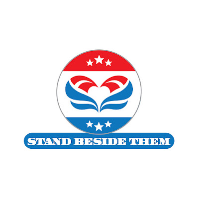
Concept Summary | Stand Beside Them

Logo Designer Austin-Stand Beside Them Logo Austin 

 Logo created for a Non-Profit Organization Supporting US Veterans


 A non-profit needed help creating a new logo for their organization promoting the mental health and well being of US Veterans. After looking at several Austin Logo Design companies, I'm glad they selected me. The logo needed to feel patriotic, evoke a feeling of warmth and compassion...The idea of creating a "heart" in the negative space really created the perfect focal point as the shapes on either side resemble a waving flag, further emphasizing the vision for the logo.


Wednesday, November 17, 2021

Concept Summary | Central Texas Clinical Research


Logo Designer Austin-CTCR Logo Austin

Logo created for a Texas Clinical Research Company


Central Texas Clinical Research contacted me in need of a rebrand. As an experienced logo designer, they came to the right place. This organization conducts clinical trials so it was absolutely essential that the logo did NOT come across as too intimidating or "clinical."

The logo concept I came up integrating the "State of Texas" shape within the band-aid. Since this can be an intimidating place to go, I wanted to create the logo with feeling of warmth and hospitality.  The colors I chose were also very bright and cheerful using blues and oranges to really make the logo pop. Being an experience logo design company in Austin for over 20 years now, I really know what it takes to create a successful brand.

Concept Summary | Ozzie Futbol


Logo created for a Youth Soccer Coach


A soccer coach hired me as his local Austin logo designer in need of a spectacular logo for his business. His new soccer program specialized in youths so the logo needed to have an appeal for a younger audience. 

The idea behind this deign was to really emphasize the concept of growth and development. By the "roots" coming off of the "O" in the company name, this promotes a sense of movement as it wraps around the soccer ball.  Organic, earth tone colors were also key to this idea of "growth" to further compliment the root system. 

You can view more of my design portfolio here: www.sabagraphix.com

Thursday, November 4, 2021

Poster Design | Love Letters


Theatrical Poster Design for Love Letters
 

When a theater company putting on a new play asked me to design their new poster, I couldn't have been more thrilled. They were looking for a talented Austin Tx graphic designer who could create a unique, fresh design on a play that was originally published in 1989. My task as their graphic designer was to design a poster that had a new take with a visually engaging look & feel.

The play, Love Letters by A.R. Gurney allowed me to create something new and progressive. As an experienced graphic designer in Austin, I was given the creative freedom to put my own flavor on the design. The visuals are all there...the rose as the ultimate symbol of love and love letters scattered throughout the design. But it's how this design was created is what makes it so unique. A much more modern interpretation of a rose with a very clean, simple layout really catches your eye. The client was extremely pleased and was exactly what they were envisioning.

Poster Design | Beleza MedSpa

Poster Design for Beleza MedSpa
 

Beleza MedSpa contacted me looking for an Austin graphic designer to help them rebrand their business. The concept of "Redefine Yourself" was an idea I pitched and they loved it. I took the meaning of "redefine" and came up with a poster design that integrates movement and the symbolism of butterflies...the idea of transformation, really came together in a perfect design. 

Choosing the right Austin graphic design company to design their poster paid off for Beleza as SABA GRAPHIX was able to deliver a fresh new poster design that would translate into both digital and other marketing materials such as direct mail campaigns and email marketing campaigns.

Tuesday, November 2, 2021

Poster Design | March of Dimes


Poster Design for March of Dimes Gala Fundraiser
 

The March of Dimes was looking for the right fit for a Graphic Designer in Austin, TX to help them create their poster for a big Gala in the fall. The event would be introducing local chefs that would create dishes to sample, while the theme was to be based on the Grand Prix race in Monte Carlo. Being a big F1 racing fan myself, this was a perfect project for me! 

The poster design would then translate into flyers, stickers, table cloths, and other signage throughout the event. It was essential that the color scheme remain classy and cool..hence playing off the March of Dimes logo with the purple and black to give it a classic racing feel. 

The poster has a very symmetrical feel but what I like is the subtle creative element of the tire track going through the middle of the design to break up the space a little with a creative touch. Being a graphic designer in Austin for over 20 years, I was excited to be a part of such a prestigious event. The client was very happy with the poster as well as all other marketing materials designed with it....and the gala was a huge success!

Poster Design | Nature


Poster Design
 

 A client hired Austin graphic design firm, SABA GRAPHIX, with a dream...he was drawn to this quote by William Blake and hired me to design a poster based on that copy. The concept was simple. Take the quote, really read it,  and create a poster that evokes the feel of the text...nature, texture, organic, simple, warm and inviting. 

I had a lot of fun creating this design. I wanted to make it feel raw, gritty, yet still very organic, elegant and classy. In order to do this I integrated several techniques to blend the background imagery and create almost a water color effect with the addition of bark and tree imagery throughout the layout.

Where this design really comes to life is the typography. I wanted to fonts to feel like artwork and not just placed there, "cold" and uninviting, but instead an essential part of the design itself. Needless to say the client was thrilled with the finished piece. I was too. Poster design is just one service Austin Tx Graphic Design Firm SABA GRAPHIX can do. From posters to logos to website, I can do it all and really help elevate your brand for your business OR in this case for a personal project.


Poster Design | Children's Center of Austin


Poster Design for The Children's Center of Austin
 

I really had a lot of fun with this poster design project. The Children's Center of Austin called me in need of a poster design that could easily translate to print marketing materials such as brochures, folders and postcards. After interviewing several qualified Austin Graphic Designers, they chose SABA GRAPHIX to handle the job to create this poster as well as other marketing material to match.

I wanted to integrate texture from a tree (top and bottom bars) to represent growth and stability as well as give it a VERY visual appeal. Using a technique called a "clipping mask" I integrated several images of children in different settings that actually formed the letters of the name, making for a very fun effect.

This poster was to be scaled very large so it was important that the overall design had a very clean look that was also very easy to read. It's important for any Austin graphic designer to understand the usage for a particular project so you know how to best create and execute the design.

Poster Design | Fisker Karma


Poster Design for Fisker Karma Electric Vehicle
 

My client was looking for a talented Austin Graphic Designer to help him bring awareness to electric car technology. The new Fisker Karma was an electric car ahead of its time with a very sporty appearance, extremely fast and ready to turn heads. 

My job was to create a visually engaging poster design which would later translate into other digital media and marketing material to get the buzz out for electric car technology. 

This design is a play off the name of the car, "Karma" with the phrase "Do You Believe In Karma" as a catchy headline. Hiring a qualified Austin Graphic Design Firm is essential to any business owner to really create professional branding.

Book Cover Design | The Foundation of Success

Book Cover Design
 

This client was looking for a book cover design to showcase his new book about business ethics and how to create healthy business working relationships to grow your business. 

Creating a book cover is a fun project for me as a Austin graphic designer. The client wanted the book design to have a very elegant, classic look, something that was almost from another time in history. 

Giving the design a historic look, rich in texture and keeping a simple monochromatic color scheme really gave the book the look and feel my client was envisioning.  You can view more of my Austin Tx Graphic Design Portfolio here to see samples of other book cover design, brochures, logo design and more.